Buy & Bill Landing Page - A/B Testing
A conversion-focused landing page with A/B testing to determine whether healthcare providers respond better to product features or financial outcomes when evaluating inventory management software.
Overview
I designed two hero variants for the same landing page:
A → product-first (interface, features)
B → profit-first ($40k/month breakdown)
All other page content remained identical. The test measured which framing drove higher engagement with the embedded ROI calculator + demo requests.
Challenge
Healthcare providers evaluating inventory management solutions needed to understand how PULSE's Buy & Bill module addresses their operational challenges. The marketing team faced a strategic question: should the page lead with product capabilities or financial impact?
This required two distinct hero sections — while keeping downstream messaging consistent.
Key Objectives
• Communicate product value clearly to time-constrained healthcare providers
• Drive engagement with the embedded ROI calculator
• Generate qualified demo requests
• Test messaging approaches to inform broader marketing strategy
Content Architecture
Hero (A/B variant)
Why Pulse (feature benefits)
Buy & Bill lifecycle visualization
ROI Calculator
Integration partners
Testimonials w/ quantified savings
CTA (demo)
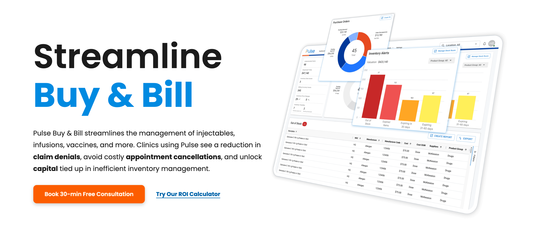
Variant A: Product-Focused
• Headline emphasized workflow
• Hero imagery displayed the PULSE product interface with dashboard screenshots
• Benefits listed as outcomes of using the system

Variant B: Profit-Focused
• Led with specific financial impact
• Rather than generic "save money" messaging, Variant B displayed exact dollar amounts with visible calculation breakdowns. This specificity served dual purposes: demonstrating confidence in the value proposition and providing verifiable claims that build trust.
• Visual featured healthcare provider with calculated savings displayed prominently
• Included disclaimer: The numbers are based on customers' statistical data
Technical Implementation
Webflow Optimize: Implemented split testing using Webflow's Optimize add-on with A/B testing functionality - 50/50 traffic split between variants
HubSpot Integration: Connected form submissions to HubSpot. Also, pipeline tracking from demo request through close
Analytics Strategy: Tracked demo request form submissions, ROI calculator completions with email capture, and bounce rate via GA4
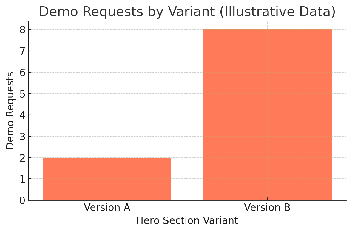
Results
Chart uses placeholder values to protect company confidentiality.
In our test the profit-focused variant -B- outperformed the product-focused variant -A- on demo requests (relative uplift shown).
Tracking & Analytics Challenges
Webflow Optimize tracked test performance within its own dashboard, showing views and conversion rates for each variant. However, this data remained isolated—HubSpot and Google Analytics couldn't attribute which variant drove specific demo requests because both versions used the same button elements and destinations.
Since Webflow Optimize was a newly released feature at the time, we implemented a verification system to ensure accurate cross-platform tracking:
Dual-Path Attribution System:
• Created two separate "Schedule a Demo" form pages (Version A and Version B)
• Built separate demo request forms for each version in HubSpot
• Variant A button → Demo Page A → Form A
• Variant B button → Demo Page B → Form B
• Buttons appeared identical to users but had different technical implementations
This parallel tracking system allowed HubSpot to show exactly which variant each demo request originated from, providing verification against Webflow's native metrics.
Discrepancy Discovery: When comparing data sources, Webflow Optimize's reported "conversions" exceeded the actual number of users who reached the demo scheduling pages. This suggested Webflow's conversion tracking captured broader engagement events (potentially button interactions, scroll depth, or other engagement signals) rather than strictly measuring demo form page visits.
What I Learned
Quantified outcomes outperform dashboard-first messaging in cost-sensitive B2B healthcare
Isolating a single variable makes test results interpretable
Hero framing sets expectation — people want reason → then product
👋🏻 Personal Notes
Getting demos is always tough, especially for a startup. Version A of the page didn’t bring in a single demo after two months. Version B got a few — not huge numbers, but still an important difference. (I cannot display the real numbers due to company confidentiality.)
What I realized is that the hero section has to earn attention fast. Almost every SaaS site shows a dashboard right at the top, and people are probably tired of seeing the same thing over and over. If you’re just landing on our site, you probably don’t want to decode a product screenshot first — you want to know why it’s worth your time.
That’s what worked better about Version B. It opened with savings data and a breakdown, which gave people trust that the numbers were real. Then we added a secondary button linking to the ROI calculator, so people could check the math themselves.
PS This page isn’t live anymore. A few months later, the company rebranded with a new logo and site, so the old design isn’t there now.
Role: Web Designer & Developer
Timeline: January - February 2025

Webflow

HubSpot

GA4

Google Tag Manager