Healthcare ROI Calculator
Transforming a complex Excel spreadsheet into an interactive 6-step web calculator for healthcare providers.
Overview
At Elevate Health Technologies, the marketing team needed an interactive ROI calculator for healthcare providers. The goal was to let prospects enter their operational data across multiple steps and instantly see how much time and cost they could save using our solutions. This project was my first real step into coding. I started with no prior experience in JavaScript, but through trial, error, and lots of learning, I designed and built a fully functional, six-step ROI calculator that became a key part of our lead generation strategy.
Challenge
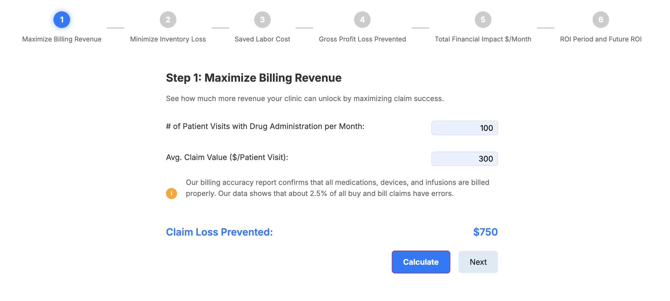
My manager approached me with an Excel spreadsheet containing sophisticated financial calculations for healthcare providers considering PULSE, our inventory management system. The task: build an interactive ROI calculator that could guide doctors and healthcare facilities through a multi-step process, performing calculations at each stage and accumulating results across six steps.
Complex Calculations: The calculator wasn’t a simple form. Each step included multiple inputs, specific calculations, and dependencies across later steps. Standard form builders (Typeform, HubSpot, etc.) couldn't handle the mathematical complexity or state management
User Experience for a Healthcare Audience: The inputs (like shipment volume, staff costs, or time saved per unit) weren’t always obvious to a doctor or clinic manager. Without guidance, the tool risked losing credibility or confusing users.
Engagement & Conversion: The team debated how much to show upfront. Should users see their step-by-step results or only the final ROI after submitting an email? Balancing transparency with lead capture was critical.
Technical Constraints
• Six sequential steps, each with unique calculations
• Steps 1-4 required individual calculations that would accumulate in Step 5
• Step 6 needed to incorporate all previous results plus new inputs about training staff
• Must maintain calculation state across the entire flow, even when users skip viewing intermediate results
• Final step required email collection and external results page integration
User Considerations
• Primary audience: healthcare providers unfamiliar with complex financial terminology
• High risk of user drop-off across six sequential steps
• Need for transparency in calculations to build trust in the software ROI claims
• Balancing information disclosure with lead generation goals
Key UX Decisions
Progressive Visual Feedback: I designed a 6-step progress indicator with numbered circles and connecting lines. Active steps highlight in blue, completed steps turn green, and lines fill in to show advancement. This constant visual feedback addresses abandonment anxiety by showing users exactly where they are and how much remains.
Contextual Information Architecture: Each step includes an orange info button that reveals explanatory text
Strategic Result Disclosure: We positioned email collection after showing complete results. While this sacrifices some conversion, it prioritizes trust and value-first engagement—more aligned with our brand and likely to improve lead quality.
Calculate vs. Next: Dual Pathway Navigation
This was our most debated design decision. Each step offers two progression options:
• Calculate button: Displays the result immediately
• Next button: Advances without showing the result
Behind the scenes, both actions perform the calculation—the difference is purely presentational. This design:
• Gives users control over their pacing
• Allows validation-seekers to see incremental progress
• Lets efficiency-focused users move quickly
• Maintains engagement by showing value building step-by-step
Analytics Strategy
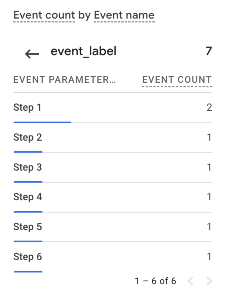
I implemented tracking on all Next buttons at each step, pushing events to Google Analytics. This allowed us to:
• Identify exact drop-off points
• Understand whether showing results affected completion rates
• Measure the full funnel from Step 1 through email submission
Key Features
Auto-formatting inputs: Numbers display with thousand separators as users type
Field validation: Required inputs checked before step progression
Smart recalculation: Step 5 automatically populates even if users skipped Calculate buttons
Responsive design: Media queries adapt layout for mobile/tablet healthcare providers
Integration: HubSpot tracking and external results page
Outcomes
The calculator launched successfully and served real users. While the project was later discontinued as company priorities shifted, it achieved its goal: providing transparent financial analysis to healthcare decision-makers.
Personally, this project was pivotal—it sparked my journey into coding and opened the door to my current role as a web designer and developer.
What I Learned
Problem decomposition: Breaking <build a calculator> into manageable pieces—navigation system, calculation logic, input handling, visual feedback—made an overwhelming task achievable.
Data-informed design: Implementing tracking wasn't about vanity metrics. It was designing with humility, acknowledging I didn't know how users would behave, and building systems to learn from them.
Trust through transparency: Our decision to show full results before requesting emails exemplifies a principle I've carried forward: prioritizing user value over aggressive conversion often yields better long-term outcomes.
👋🏻 Personal Notes
This project was my very first time coding. Looking back at this code now, I can see approaches I'd change—perhaps using a framework for state management, more sophisticated validation, or more systematic CSS architecture. But that perspective only exists because of what this project taught me.
One of the hardest parts came at the very end: collecting user emails. I didn’t know anything about setting up a backend or storing form submissions. After a lot of trial and error, I discovered that HubSpot could track non-HubSpot forms, and I hacked together a solution using their tracking code. What feels obvious to me now was a big breakthrough back then.
In the end, I managed to capture both the step-by-step results and the user’s email, which let us send them a personalized PDF with their ROI breakdown and an explanation of how the calculations were made.
This calculator marked my transformation from designer to developer, proving that the best learning happens when building something slightly beyond your current capabilities. It showed me that technical implementation and user experience design aren't separate disciplines—they're two aspects of the same problem-solving process.
Role: Web Developer & Designer
Timeline: September - December 2024
View Code
Webflow

JavaScript

HubSpot

GA4

Google Tag Manager